The Dashboard
Your dashboard is more than just a report; it’s an interactive command center for monitoring your app’s health. It gives you a high-level overview and lets you dive deep into the details when you need to. Here’s how to interpret each element to make informed decisions.
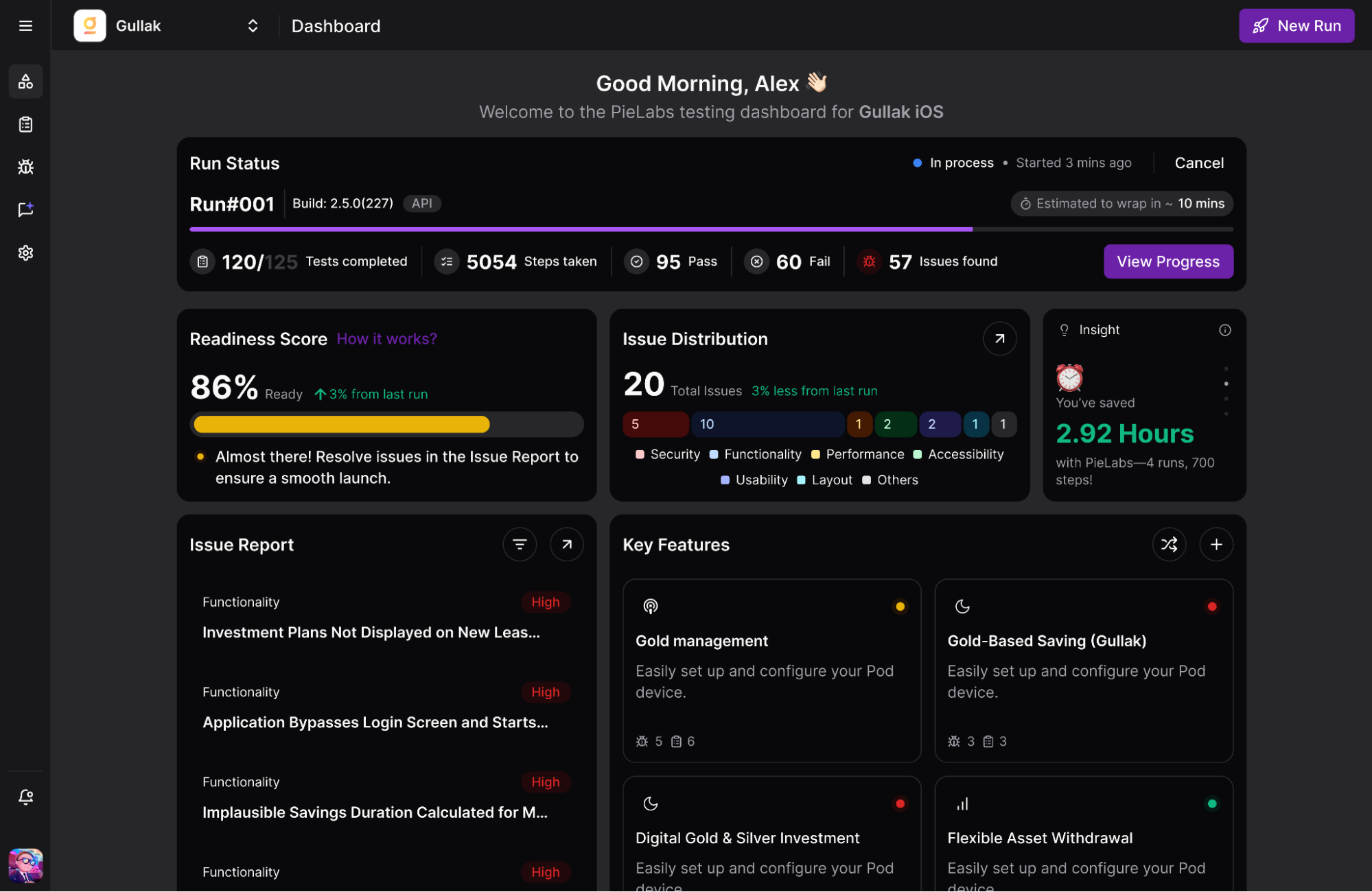
The Readiness Score
Think of this as your build’s health summary.
- 90-100%: Build is stable and likely ready for the next stage.
- 70-89%: Caution is needed; there may be minor issues to review.
- Below 70%: Signals critical problems that are likely release blockers.
Use this score to quickly decide if a build is worth a deeper look or needs to be sent back to development immediately.
Test Run Summary
This section provides the raw numbers behind the Readiness Score.
- Pass/Fail Ratio: A sudden increase in failed tests from one run to the next is a strong indicator of a significant regression.
- Hours Saved: A great metric to demonstrate the ROI of autonomous testing to your stakeholders.
Issue Distribution Chart
This chart helps you spot trends.
- A spike in “Usability” issues could indicate a recent UI change introducing friction.
- A consistent number of “Functional” bugs might highlight a fragile area of your codebase.
Use this visual to understand the nature of the problems, not just the quantity.
Key Features & Issue Report
Move from overview to action.
- Key Features: Helps contextualize where problems are happening. For example, if the Checkout Flow has 5 critical issues, you know where your most urgent problem lies.
- Issue Report: Your prioritized to-do list. Start at the top with Critical issues and work your way down.